
This project explores a survey dataset for data professionals in a dashboard created in Power BI.
Data Transformation
The Data Professional Survey dataset consists of several columns including their age, country, job role, salary, happiness with salary and work/life balance, etc. You can view the dataset on this link.
The following data tranformations were performed in Power BI:
- splitting curent role, country, industry, favorite programming language by delimiter to clean 'Other' records,
- splitting current yearly salary column by digit to non-digit and replacing the character symbols to clean salary ranges in text data type,
- creating a new column called average salary to get the average value of the two split columns from current yearly salary column.
Data Visualizations
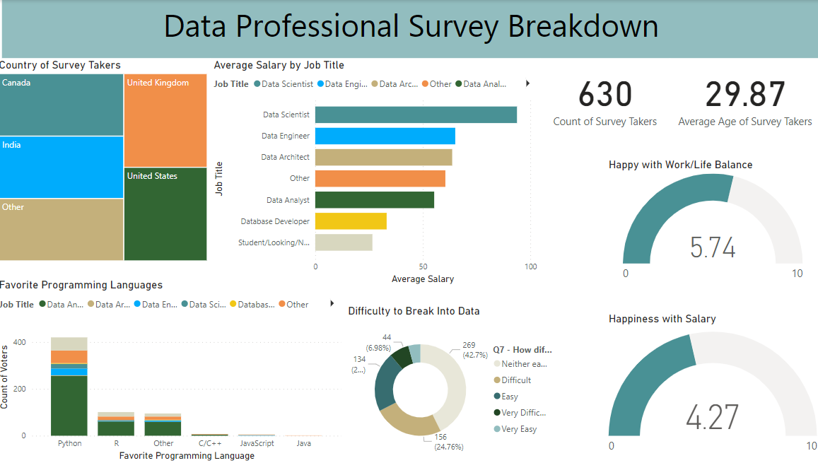
A dashboard was created in Power BI to visualize key insights, including:.
- total number of survey takers,
- average age of respondents,
- survey takers by country,
- average salary by job role,
- count of responses on favorite programming languages by job role,
- percentage of responses on difficulty of breaking into data, rated on a scale from very easy to very difficult,
- average rating of happiness with work/life balance on a scale of 1 to 10,
- average rating of happiness with salary on a scale of 1 to 10.
Insights
A few insights from the dashboard are mentioned below:
- Python is the most preferred programming language among data professionals, followed by R.
- The majority of respondents rated the difficulty of breaking into data as neutral (neither easy nor difficult), with very few considering it very easy.
- Data professionals report moderate satisfaction with work-life balance (5.74/10) but are less satisfied with salary (4.27/10), highlighting a possible gap in compensation expectations.
You can view the dashboard on this link.